Hobby Hub
One membership, every hobby studio in NYC. A credit-based marketplace that makes trying a creative class easy, affordable, and low-pressure — for the curious beginner and the independent studio alike.
Overview
Adults want to try creative hobbies. The economics make it hard.
Pottery ranked as the #1 skill adults want to learn in a 2024 UK poll (18% of respondents, Perspectus Global), and 71% of U.S. consumers identify as crafters (Mintel, 2025). The interest is real. But actually walking into a studio? That's where people get stuck.
An intro pottery class in NYC runs about $96. Painting workshops start around $45. If you're not sure you'll even like it, that's a steep bet. And on the studio side, independent shops are running classes with empty seats they can't easily fill.
Hobby Hub is a concept for a credit-based membership that connects curious adults with independent hobby studios across NYC — a ClassPass-style model adapted for the creative class economy: one subscription, flexible credits, drop-in access to pottery, painting, fiber arts, candle making, and more.
My role. I was the sole designer on this concept, responsible for market research, competitive analysis, user modeling, information architecture, interaction design, and high-fidelity prototyping in Figma.
Research
The gap between “I want to try pottery” and booking a class
I started with desk research across three areas: the hobby learner's perspective, the studio owner's business reality, and the competitive landscape. I wanted to understand not just what people want, but what structurally prevents them from getting it.
The learner's problem
Two barriers kept coming up. Cost uncertainty: with single classes ranging from $35 to $99 and multi-session packages pushing $450+, people couldn't casually sample. And social fear: 54% of Americans report being hesitant to try new activities because they're afraid of being bad at them. These aren't just preferences — they're structural blockers a simple booking site doesn't solve.
The studio's problem
Independent studios in NYC operate on thin margins. Their needs surfaced through booking policies, pricing pages, and ClassPass reviews from the studio side. They depend on marketplace platforms for 20–30% of revenue but resent opaque payouts and discount-brand association. They need strict cancellation policies (48 hours to 7 days) because materials are prepped in advance. And they fear credit platforms training customers to never pay full price.
What ClassPass gets wrong
ClassPass validated the credit model for fitness, but its reviews reveal recurring pain points a hobby-focused platform could learn from: rising credit costs with little transparency, late-cancel fees that feel punitive, unused credits that expire without warning, and hidden pricing where the real per-class cost is obscured. These aren't minor UX complaints. They're trust failures a new entrant could address from day one.
Key hypothesis. If the credit cost of every class is shown before signup, and pricing adjusts transparently based on studio time and materials, users will feel confident enough to try their first class within the trial period.
User Modeling
Two sides of the same marketplace
I developed proto-personas and jobs-to-be-done for both sides of the platform. The goal wasn't to invent fictional users, but to articulate the real motivations and fears that would shape every design decision.
NYC desk-job adult looking for a screen-free creative outlet. Has scrolled Instagram pottery videos. Hasn't booked a class.
- To try without a $450 package commitment
- To know the class is actually for beginners
- A reminder when their fired piece is ready to pick up
- Being the worst person in the room
- Wasting money on something they won't continue
Runs a small independent studio in Brooklyn. Loves teaching. Hates filling empty Tuesday afternoon seats.
- To fill slow-period seats without discounting
- To reach new guests and convert them to direct members
- Control over how many spots are released to the platform
- Platform dependency and brand cheapening
- Low, opaque payouts like ClassPass
Strategy
Designing a credit system that's actually fair
The credit model is the backbone of Hobby Hub. It needed to work for classes ranging from $35 casual workshops to $96 wheel-throwing intensives. I built the pricing logic from one principle: credit cost should reflect what the studio actually charges, not hide it.
How credits work
Studios receive at least 70% of their posted price. Demand can adjust credit cost ±25% (off-peak discounts, peak surcharges), but the base cost is always visible.
| Class price | Credits | Member pays | Studio gets (min) | HH keeps |
|---|---|---|---|---|
| $35 | 6 | $30 | $24.50 | $5.50 |
| $96 | 16 | $80 | $67.20 | $12.80 |
| $99 | 17 | $85 | $69.30 | $15.70 |
Three plans, transparent pricing
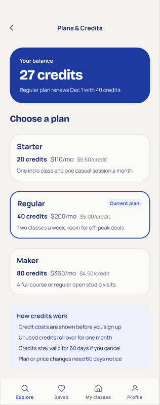
I designed three tiers based on usage patterns, each with its per-credit cost shown up front.
Trust rules baked into the product
Each rule answers one of the ClassPass trust failures directly.
Design Principles
Five rules I designed by
These emerged from the research and became my checklist for every screen decision.
Information Architecture
The core loop: discover, book, make, collect
Unlike fitness, where the workout is the product, hobby classes produce something tangible. That changes the post-class experience entirely — and creates a natural reason to come back.
Each stage maps to screens with clear jobs. Discover surfaces first-timer-friendly classes with transparent credit costs. Book shows the full credit breakdown including any off-peak discount. Attend gives you a ticket with everything you need before walking in. Reflect lets you rate the experience and photograph what you made. And Collect turns finished pieces into a personal portfolio that suggests your next class.
Visual Design
Warm, not cold. Confident, not corporate.
The visual system needed to feel like an invitation, not a SaaS dashboard. Cobalt on warm cream is the primary palette: cobalt carries authority without feeling clinical, and the warm canvas keeps things approachable. Honey gold marks anything credit-related, reinforcing the value system at a glance.
Bricolage Grotesque for headings (distinctive, slightly playful) pairs with Manrope for body text (clean, highly readable). Crafted without being precious.
Final Designs
Walking through the key screens
Onboarding
The onboarding sequence uses kinetic typography to communicate the value proposition in three swipes: one membership, every studio, credits that make sense. No account creation until after you've seen what's available.

Explore and discovery
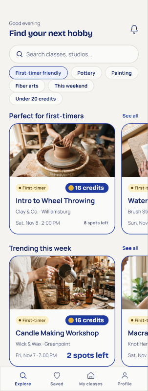
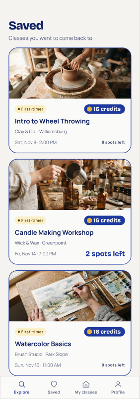
Explore leads with “Perfect for first-timers,” directly addressing the biggest anxiety. Every class card shows its credit cost upfront, spots remaining, and whether it's beginner-friendly. Quick-filter chips narrow by hobby type, difficulty, or budget.

The booking flow
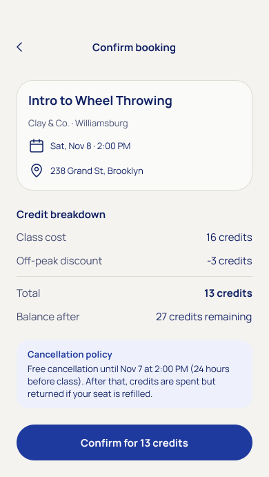
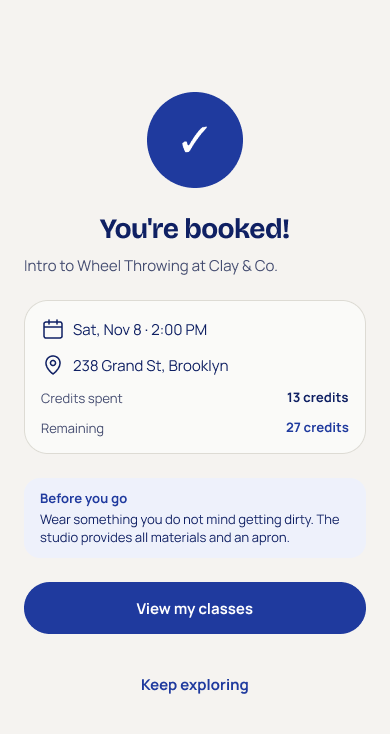
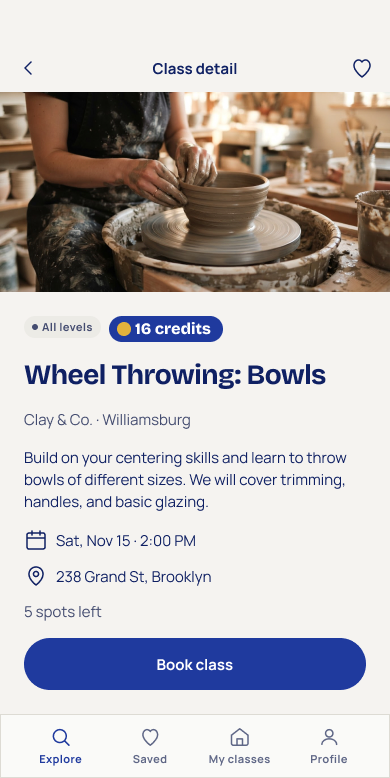
Booking is designed for zero surprises. Confirmation breaks down exactly how credits are spent: base cost, any off-peak discount, total, and your remaining balance. The cancellation policy is front and center, not buried in fine print. After booking, a “Before you go” tip helps you show up prepared, not anxious.
Attend and reflect
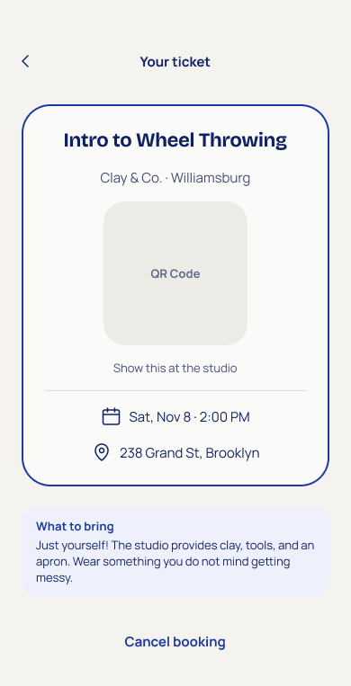
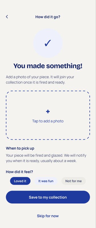
The ticket is your day-of companion: QR code for check-in, time and address, and practical tips. After class, “How did it go?” does double duty — it captures sentiment (“Loved it” / “It was fun” / “Not for me”) and invites you to photograph what you made. That photo joins your collection once the piece is fired and ready.
Collection and credits
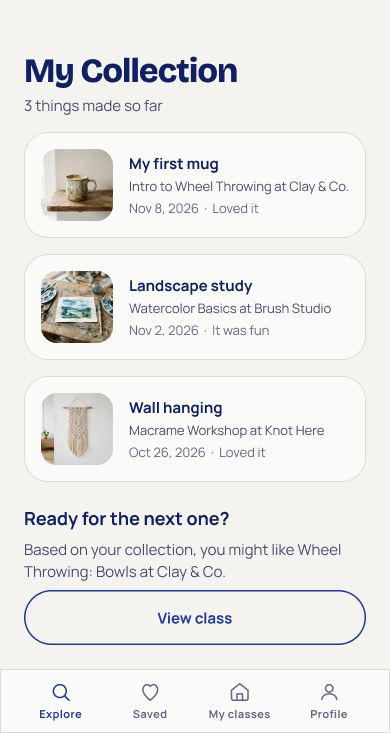
The collection is the habit engine. Unlike fitness apps, where workouts are invisible once they're done, hobby classes produce things. Your collection shows every piece you've made, when, and how you felt about it — then suggests your next class. On the credit side, Plans & Credits shows your balance, renewal date, and every tier with transparent per-credit pricing.
All screens
The complete screen inventory, covering the consumer journey from onboarding through collection.
Reflection
What I'd explore next
This is a concept project, and I want to be transparent about what's proven and what's still hypothesis. The research signals are real: the demand for creative hobbies, the barriers to trying, the trust issues with existing credit platforms. The design decisions are grounded in those signals. But several questions would need real-world validation.
Research benchmarks are cited inline, sourced from public reports, review aggregators, and marketplace listings. No user metrics were fabricated for this concept project.